Showing posts with label PerfViz. Show all posts

Monday, June 25, 2018

Guerrilla 2018 Classes Now Open

All Guerrilla training classes are now open for registration.
  1. GCAP: Guerrilla Capacity and Performance — From Counters to Containers and Clouds
  2. GDAT: Guerrilla Data Analytics — Everything from Linear Regression to Machine Learning
  3. PDQW: Pretty Damn Quick Workshop — Personal tuition for performance and capacity mgmt

The following highlights indicate the kind of thing you'll learn. Most especially, how to make better use of all that monitoring and load-testing data you keep collecting.

See what Guerrilla grads are saying about these classes. And how many instructors do you know that are available for you from 9am to 9pm (or later) each day of your class?

Who should attend?

  • IT architects
  • Application developers
  • Performance engineers
  • Sysadmins (Linux, Unix, Windows)
  • System engineers
  • Test engineers
  • Mainframe sysops (IBM. Hitachi, Fujitsu, Unisys)
  • Database admins
  • Devops practitioners
  • SRE engineers
  • Anyone interested in getting beyond performance monitoring

As usual, Sheraton Four Points has bedrooms available at the Performance Dynamics discounted rate. The room-booking link is on the registration page.

Tell a colleague and see you in September!

Wednesday, February 19, 2014

Facebook Meets Florence Nightingale and Enrico Fermi

Highlighting Facebook's mistakes and weaknesses is a popular sport. When you're the 800 lb gorilla of social networking, it's inevitable. The most recent rendition of FB bashing appeared in a serious study entitled, Epidemiological Modeling of Online Social Network Dynamics, authored by a couple of academics in the Department of Mechanical and Aerospace Engineering (???) at Princeton University.

They use epidemiological models to explain adoption and abandonment of social networks, where user adoption is analogous to infection and user abandonment is analogous to recovery from disease, e.g., the precipitous attrition witnessed by MySpace. To this end, they employ variants of an SIR (Susceptible Infected Removed) model to predict a precipitous decline in Facebook activity in the next few years.

Channeling Mark Twain, FB engineers lampooned this conclusion by pointing out that Princeton would suffer a similar demise under the same assumptions.

Irrespective of the merits of the Princeton paper, I was impressed that they used an SIR model. It's the same one I used, in R, last year to reinterpret Florence Nightingale's zymotic disease data during the Crimean War as resulting from epidemic spreading.

Another way in which FB was inadvertently dinged by incorrect interpretation of information—this time it was the math—occurred in the 2010 movie, "The Social Network" that tells the story of how FB (then called Facemash) came into being. While watching the movie, I noticed that the ranking metric that gets written on a dorm window (only in Hollywood) is wrong! The correct ranking formula is analogous to the Fermi-Dirac distribution, which is key to understanding how electrons "rank" themselves in atoms and semiconductors.


"The reports of my death have been greatly exaggerated."

Monday, July 8, 2013

What's Wrong with This Picture?

Here are some examples of how not to display performance data. Remember: collecting and analyzing your performance data is only half the battle. The other, equally difficult, half is presenting your performance data and conclusions.

Example 1

This first example is an oldie but a baddie. It will also provide some context for the second example below.

Figure 1 (click to enlarge)
See the problem?

Thursday, February 7, 2013

Extracting the Epidemic Model: Going Beyond Florence Nightingale Part II

This is the second of a two part reexamination of Florence Nightingale's data visualization based on her innovative cam diagrams (my term) shown in Figure 1.

Figure 1. Nightingale's original cam diagrams (click to enlarge)

Recap

In Part I, I showed that FN applied sectoral areas, rather than a pie chart or conventional histogram, to reduce the visual impact of highly variable zymotic disease data from the Crimean War. She wanted to demonstrate that diminishing disease was due mostly to her sanitation methodologies. The square-root attenuation of magnitudes, arising from the use of sectoral areas, helped her accomplish that objective. In addition, I showed that a plausibly simpler visualizaiton could have been had with a single 24-month cam diagram. See Fig. 2.

Figure 2. Combined 24-month cam diagram

Wednesday, January 23, 2013

Going Beyond Florence Nightingale's Data Diagram: Did Flo Blow It with Wedges?

In 2010, I wrote a short blog item about Florence Nightingale the statistician, solely because of its novelty value. I didn't even bother to look closely at the associated graphic she designed, but that's what I intend to do here. In this first installment, I reflect on her famous data visualization by reconstructing it with the modern tools available in R. In part two, I will use the insight gained from that exercise to go beyond data presentation to potentially more revealing data modeling. Interestingly, I suspect that much of what I will present could also have been accomplished in Florence Nightingale's day, more than 150 years ago, albeit not as easily and not by her alone.

Figure 1. Nightingale and her data visualization (click to enlarge)

Although Florence Nightingale was not formally trained as a statistician, she apparently had a natural aptitude for mathematical concepts and evidently put a lot of thought into presenting the import of her medical findings in a visual way. Click on Figure 1 to enlarge it and view the details in her original graphic. As a consequence, she was elected the first female member of the Royal Statistical Society in 1859 and later became an honorary member of the American Statistical Association.

Why Wedges?

Why did FN bother to construct the data visualization in Figure 1? If you read her accompanying text, you see that she refers to the sectors as wedges. In a nutshell, her point in devising Figure 1 was to try and convince a male-dominated, British bureaucracy that better sanitary methods could seriously diminish the adverse impact of preventable disease amongst military troops on the battlefield. The relative size of the wedges is intended to convey that effect. Later on, she promoted the application of the same sanitation methodologies to public hospitals. She was using the established term of the day, zymotic disease, to refer to epidemic, endemic, and contagious diseases.

Sunday, April 1, 2012

Sex, Lies and Log Plots

From time to time, at the Hotsos conferences on Oracle performance, I've heard the phrase, "battle against any guess" (BAAG) used in presentations. It captures a good idea: eliminate guesswork from your decision making process. Although that's certainly a laudable goal, life is sometimes not so simple; particularly when it comes to performance analysis. Sometimes, you really can't seem to determine unequivocally what is going on. Inevitably, you are left with nothing but making a guess—preferably an educated guess, not a random guess (the type BAAG wants to eliminate). As I say in one of my Guerrilla mantras: even wrong expectations (or a guess) are better than no expectations. In more scientific terms, such an educated guess is called a hypothesis and it's a major way of making scientific progress.

Of course, it doesn't stop there. The most important part of making an educated guess is testing its validity. That's called hypothesis testing, in scientific circles. To paraphrase the well-known Russian proverb, in contradistinction to BAAG: Guess, but justify*. Because all hypothesis testing is a difficult process, it can easily get subverted into reaching the wrong conclusion. Therefore, it is extremely important not to set booby traps inadvertently along the way. One of the most common visual booby trap arises from the inappropriate use of logarithmically-scaled axes (hereafter, log axes) when plotting data.

Linear scale:
Each major interval has a common difference $(d)$, e.g., $200, 400, 600, 800, 1000$ if $d=200$:

Log scale:
Each major interval has a common multiple or base $(b)$, e.g., $0.1, 1, 10, 100, 1000$ if $b=10$:

The general property of a log axis is to stretch out the low end of the axis and compress the high end. Notice the unequal minor interval spacings. Hence, using a log scaled axis (either $x$ or $y$) is equivalent to applying a nonlinear transformation to the data. In other words, you should be aware that introducing a log axis will distort the visual representation of the data, which can lead to entirely wrong conclusions.

Wednesday, August 17, 2011

IBM Introduces the Cognitive Chip

Last week, in the GDAT class, we were discussing performance visualization tools as requiring a good impedance match between the digital computer under analysis and the cognitive computer of the analyst—AKA the brain.

Wednesday, August 11, 2010

GDAT Visualization: Black Friday at eBay

This animated heatmap visualization of Black Friday transaction volumes at eBay


was brought to our attention in the GDAT class today, compliments of Matt C. from PayPal.

Sunday, August 1, 2010

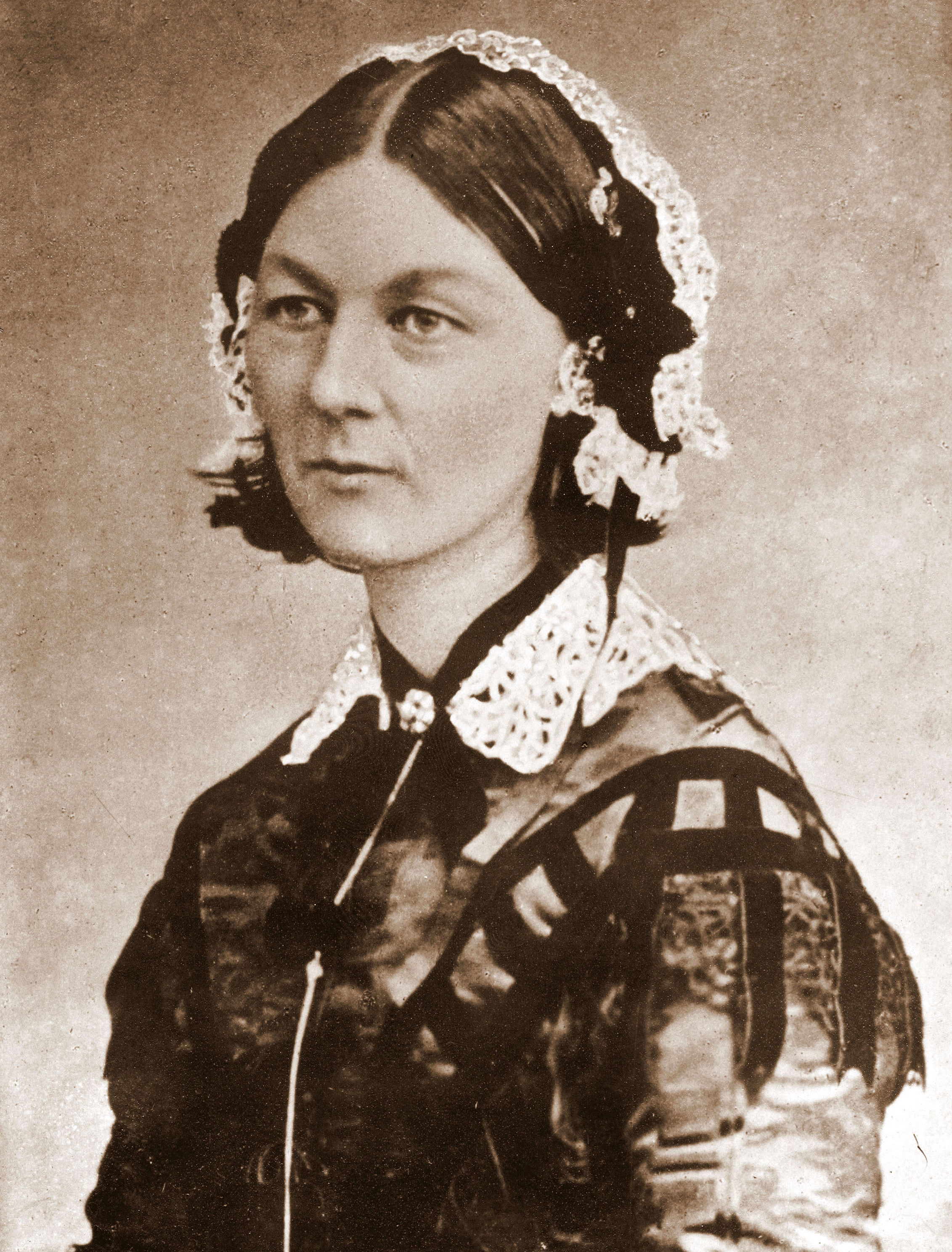
Florence Nightingale was a Statistician

Florence Nightingale was elected the first female member of the Royal Statistical Society in 1859 and she later became an honorary member of the American Statistical Association. She also travelled with a pet owl in her pocket. [Source: Graham Farmelo]


Moreover, she was also a pioneer in data visualization by virtue of developing a form of pie chart known today as the polar area diagram.

Monday, September 14, 2009

Anti Log Plots

A sure sign that somebody doesn't know what they're doing is, when they plot their data on logarithmic axes. Logarithmic plots are almost always the wrong thing to use. The motivation to use log axes often arises from misguided aesthetic considerations, rather than any attempt to enhance technical understanding, e.g., trying to "compress" a lot of data points into the available plot width on a page. The temptation to use log plots is also too easily facilitated by tools like Excel, where re-scaling the plot axes is just a button-click away.

Wednesday, March 11, 2009

Treemap Visualization of Disk Volumes

GrandPerspective is a FOSS tool for Mac OS X that provides a treemap visualization of file layout on a disk. I created the treemap below from an 80 GB disk on my G4 towermac, which has both Mac OS X files (left) and WinXP files (right); the latter being a copy from the disk of my recently deceased Sony laptop). It certainly gives new meaning to the term disk blocks.


It's quite striking to see the greater number of larger aggregations of files on the Mac side vs. the many smaller files on the XP side. I guess that's why we don't need to do "defragging" on macs. :-)

Tuesday, February 17, 2009

Apdex Index Examined

This month's edition of the CMG MeasureIT open-access journal has 2 articles on the Apdex Performance Index:
  1. "The Apdex Index Revealed", by yours truly
  2. "The Apdex Index vs Traditional Management Information Decision Tools", by Jim Brady
Jim's article compares the Apdex Index with other well-established management decision techniques; especially those based on statistical methods. As someone with a background in Operations Research, Jim is well placed to make these assessments. It's worth noting that Jim's paper arose out of PARS discussion he and I had at CMG'08 in Las Vegas. PARS stands for Performance Analysts' Relaxation Session (a play on mainframe LPARS) but most CMG-ers just think of it as a "free" food and booze session. ;-) I was relating to Jim that I had attended a couple of CMG presentations which tried to explain the deeper significance of the Apdex Index definitions and there were a few things that really bothered me. I thought he might be able to explain it to me in terms of mathematical statistics. We didn't resolve anything that night (what can you expect with all that booze around?), so I left it with him as homework. His paper is the outcome. You'll have to read my article to find out what was bothering me. :-)

Monday, November 24, 2008

Worldwide Supercomputer Ratings

Interesting visualization of worldwide supercomputer performance. These Flash bubble-charts seem to be de rigueur for the NYT now. Bubble diameters are proportional to their TFLOPS rating and the location of each bubble cluster is topologically correct with respect to geographical location, but not by Euclidean distance; which is probably why it wasn't superimposed on a map.

The breakdown of these top-100 machines by processor family (not shown there) looks like this:

  1. Intel: 75.6%
  2. IBM: 12%
  3. AMD: 12%
  4. NEC: 0.2%
  5. SPARC: 0.2%
However, the number 1 machine (at 1.1 petaFLOPs) is based on the IBM Cell processor.

Tuesday, October 14, 2008

Perceiving Patterns in Performance Data

All meaning has a pattern, but not all patterns have a meaning. New research indicates that if a person is not in control of given situation, they are more likely to see patterns where none exist, see illusions and believe in conspiracy theories. In the context of computer performance analysis, the same conclusion might apply when you are looking at data collected from a system that you don't understand.

Put differently, the less you know about the system, the more inclined you are to see patterns that aren't there or that aren't meaningful. This is also one of the potential pitfalls of relying on sophisticated data-visualization tools. The more sophisticated the tools, the more likely you are to be seduced into believing that any observed patterns are meaningful. As I've said elsewhere ...


The research experiments used very grainy pictures, some of which had embedded images and others which did not.

Thursday, September 18, 2008

My CMG 2008 Presentations


  1. Sunday Workshop: "How High Will It Fly? Predicting Scalability"
    Session 184, Sunday 8:30 AM - Noon
    Room: Champagne 3/4

Friday, March 7, 2008

Hotsos 2008: Day 3

Only two things happened today; I gave my presentation on "Better Performance Management through Better Visualization Tools" and I met with Bob Sneed because he also asked my to review his presentation.

Hotsos 2008: Day 2

Tanel Poder continued his theme of better ways to collect Oracle performance data by demonstrating how his "Sesspack" (Oracle session level) data could be visualized using VBA calls to Excel charting functionality. He used Swingbench as a load generator for his demos. Afterwards, I spoke with him about my talk tomorrow and he said he was interested and would attend.

Wednesday, December 19, 2007

CMG 2008: Call for PerfViz Papers

It's official! Performance visualization is a "focus area" within the Hot Topics Session Area track for CMG 2008 in Las Vegas, Nevada. The official CFP is now posted and Jim Holtman and I are the Session Area Chairs (SACs) for Hot Topics. In an attempt to build of the recent success of the Barry007 presentations at CMG 2007, we would like to see many more diverse contributions on PerfViz: Better computer performance and planning through better visualization tools, in 2008.

Wednesday, November 28, 2007

Apdex Meets Apex

The Apdex Alliance has defined a performance metric, called the Apdex index, which rates the measured response times of distributed applications from an Internet user perspective. The Apdex index is constructed from three categories which are defined by partitioning the total number of sample counts (C) according to an agreed upon threshold time (Ï„):
  1. Satisfied (0 < S < Ï„)
  2. Tolerating (Ï„ < T < 4Ï„)
  3. Frustrated (F > 4Ï„)