Showing posts with label big data. Show all posts

Sunday, August 25, 2013

GDAT Class October 14-18, 2013

This is your fast track to enterprise performance and capacity management with an emphasis on applying R statistical tools to your performance data.

Early-bird discounts are available for the Level III Guerrilla Data Analysis Techniques class Oct 14—18.

Entrance Larkspur Landing hotel Pleasanton California

As usual, all classes are held at our lovely Larkspur Landing location in Pleasanton. Attendees should bring their laptops to the class as course materials are provided on a flash drive. Larkspur Landing also provides free wi-fi Internet in their residence-style rooms as well as the training room.

Monday, April 22, 2013

Upcoming GDAT Class May 6-10, 2013

Enrollments are still open for the Level III Guerrilla Data Analysis Techniques class to be held during the week May 6—10. Early-bird discounts are still available. Enquire when you register.

Entrance Larkspur Landing hotel Pleasanton California


As usual, all classes are held at our lovely Larkspur Landing location. Before registering online, take a look at what former students have said about the Guerrilla courses.

Attendees should bring their laptops, as course materials are provided on CD or flash drive. Larkspur Landing also provides free Internet wi-fi in all rooms.

Tuesday, April 9, 2013

Harmonic Averaging of Monitored Rate Data

The following slides constitute evolving notes made in response to remarks that arose during the Monitorama Conference in Boston MA, March 28-29, 2013. Since they are evolving, the content will be updated continuously in place. So, get on RSS or Twitter or check back often to read the latest version.

During the Graphite workshop session at Monitorama, the topic of aggregating monitored rate data came up. This caused me to interject the cautionary comment:

Friday, March 29, 2013

Monitorama 2013 Conference

Here is my Keynote presentation that opened the first Monitorama conference and hackathon in Cambridge MA yesterday:

Comments from the #monitorama Twitter stream:

Sunday, January 6, 2013

Visualizing Variance

The typical presentation of variance in textbooks often looks like this Wikipedia definition. Quite daunting for the non-expert. So, how would you explain the notion of variance to someone who has little or no background in statistics and couldn't easily digest all that gobbledygook?

The Mean

Let's drop back a notch. How would you explain the statistical mean? A common way to do that is to utilize the simple visual device of the "bell curve" belonging to the normal distribution (Fig. 1).

Figure 1. A normal distribution

The normal distribution, $N(x,\mu,\sigma^2)$, is specified by two parameters:

  1. Mean, usually denoted by $\mu$
  2. Variance, usually denoted by $\sigma^2$
that determine (1) the location and (2) the shape of the curve. In Fig. 1, $\mu = 4$. Being a probability, the curve must be normalized to enclose unit area. Also, since $N(x)$ is unimodal and symmetric about $\mu$, the mean, median and mode are all located at the same position on the $x$-axis. Therefore, it's easy to point to the mean as being the $x$-position of the peak. Anybody can see that immediately. Mission accomplished.

But what about the variance? Where is that in Figure 1?

Monday, October 24, 2011

Webinar: Load Testing Meets Data Analytics

This Thursday, October 27 at 10 am PDT*, I'll be participating in a webinar sponsored by SOASTA, Inc. They make a new breed of load-testing product called CloudTest® which, despite its name, is not restricted to load testing cloud-based apps, although it can do that too.

Saturday, August 13, 2011

GDAT 2011 in Review

As usual, the Guerrilla Data Analysis Techniques (GDAT) class was a total blast. Motivated students always guarantee that. It would really help our scheduling, however, if people didn't wait until the last nanosecond to register for the class. But given the crazy economic climate, I'm more than happy to do whatever it takes to make GDAT fly.

Some course highlights that you missed:

Sunday, July 25, 2010

World Datacenter Storage at 1 ZB

Heard on the BBC World Service:
"The world is drowning in a sea of data. Facebook users alone are uploading more than a thousand photos a second. We're now seeing an exponential explosion of information. So how much information are we really storing?"

Tuesday, November 24, 2009

GCaP Class: Sawzall Optimum

In a side discussion during last week's class, now Guerrilla alumnus, Greg S. (who used to work at Google a few years ago) informed me that typical Sawszall preprocessing-setup times typically lie in the range from around 500 ms to about 10 seconds, depending on such factors as: cluster location, GFS chunkserver hit rate, borglet affinity hits, etc. This is the information that was missing in the original Google paper and prevented me from finding the optimal machine configuration in my previous post.

To see how these new numbers can be applied to estimating the corresponding optimal configuration of Sawzall machines, let's take the worst case estimate of 10 seconds for the preprocessing time. First, we convert 10 s to 10/60 = 0.1666667 min (original units) and plot that constant as the horizontal line (gray) in the lower part to the figure at left (click to enlarge). Next, we extend the PDQ elapsed-time model (blue curve) until it intersects the horizontal line. That point is the optimum, as I explained in class, and it occurs at p = 18,600 machines (vertical line).

That's more than thirty times the number of machines reported in the original Google paper—those data points appear on the left side of the plot. Because of the huge scale involved, it is difficult to see the actual intersection, so the figure on the right shows a zoomed-in view of the encircled area. Increasing the number of parallel machines beyond the vertical line means that the elapsed time curve (blue) goes into the region below the horizontal line. The horizontal line represents the fixed preprocessing time, so it becomes the system bottleneck as the degree of parallelism is increased. Since the elapsed times in that region would always be less than the bottleneck service time, they can never be realized. Therefore, adding more parallel machines will not improve response time performance.

Conversely, a shorter preprocessing time of 500 ms (i.e., a shorter bottleneck service time) should permit a higher degree of parallelism.

Friday, November 13, 2009

Scalability of Sawzall, MapReduce and Hadoop

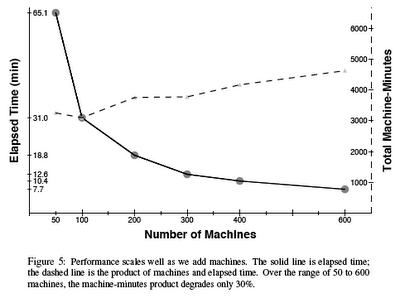
This is a follow-up to a reader comment by Paul P. on my previous post about MapReduce and Hadoop. Specifically, Paul pointed me at the 2005 Google paper entitled "Parallel Analysis with Sawzall," which states:

"The set of aggregations is limited but the query phase can involve more general computations, which we express in a new interpreted, procedural programming language called Sawzall"

Not related to the portable reciprocating power saw manufactured by the Milwaukee Electric Tool Corporation.

More important, for our purposes, is Section 12 Performance. It includes the following plot, which tells us something about Sawzall scalability; but not everything.

Figure 1.

Thursday, October 15, 2009

Hadoop, MAA, ML, MR and Performance Data

Over the past few months, I've been attending a series of talks on machine learning (ML), sponsored by ACM.org at the NASA Ames Research Center, with an eye to applying such things to gobs of computer performance data. Two pieces of technology that kept cropping up were Google MapReduce and Apache Hadoop.

Monday, March 23, 2009

Streaming Hadoop Data Into R Scripts

Along the lines of Mongo Measurement Requires Mongo Management, the HadoopStreaming package on CRAN provides utilities for applying R scripts to Hadoop streaming.

Hadoop has been deployed on Amazon's EC2. See our more recent ACM article, "Hadoop Superlinear Scalability: The Perpetual Motion of Parallel Performance" for a more detailed discussion about scalability issues.

Higgs Slapping Starts Early

As I said in my A.A. Michelson Award acceptance speech, the search for the Higgs boson could turn out to be the 21st century null-experiment that supersedes the 19th century Michelson-Morley search for the aether. The big difference is in the amount of data that will be generated by the LHC, viz., 15 PB per year.

Since finding the Higgs in all those data will be like searching for the proverbial "needle," the pressure is on to justify the investment in the European machine (LHC-CMS for $10B) at CERN and the lack of investment by the U.S. Congress in the Texas Supercollider (SSC for $12B); much less than a bank bailout today. The proxy for the SSC is the aging machine at Fermilab. Because of the pressure to see something, I fully expect a lot of false positives to be reported and that will inevitably degenerate into arguments over confidence intervals for the data; just the kind of thing we discuss in the GDAT class next August.


However, I didn't expect things to really heat up until the LHC comes back online in the summer, after repairs to the collapsed superconducting magnets. In the meantime, however, the global economy has also collapsed and Fermilab is hurting for funds. So, while the LHC is down for the count, the Fermilab Dzero experiment is looking for the Higgs and getting in the news by setting some bounds on the energy ranges where the Higgs might live. Without getting into too much detail, the above diagram shows that the plausible range for the Higgs mass (mH) is 114 GeV < mH < 185 GeV (according to Fermilab). For reference, your analog TV set produces electrons that hit the screen with an energy of about 30 KeV. Mass and energy are directly related by Einstein's famous equation E = mc2, where c is the speed of light in vacuo.

This opportunistic move has set off a slapfest between some physicists at Fermilab and the CERN. If it's this ugly now, I don't know where it's going to go when those gaps close down to zero; apart from the obvious escape route that it's much heavier than 250 GeV.

Thursday, January 8, 2009

Review of R in NYT and GDAT

GDAT instructor, Jim Holtman, pointed me at this review of R in yesterday's New York Times. It definitely puts SAS on the defensive.

Update: Another piece in the tech section of NYT.

If you want to know how to apply R to performance data, sign up for the Guerrilla Data Analysis Techniques class scheduled for August 2009 and learn from Jim personally.

Tuesday, October 14, 2008

Perceiving Patterns in Performance Data

All meaning has a pattern, but not all patterns have a meaning. New research indicates that if a person is not in control of given situation, they are more likely to see patterns where none exist, see illusions and believe in conspiracy theories. In the context of computer performance analysis, the same conclusion might apply when you are looking at data collected from a system that you don't understand.

Put differently, the less you know about the system, the more inclined you are to see patterns that aren't there or that aren't meaningful. This is also one of the potential pitfalls of relying on sophisticated data-visualization tools. The more sophisticated the tools, the more likely you are to be seduced into believing that any observed patterns are meaningful. As I've said elsewhere ...


The research experiments used very grainy pictures, some of which had embedded images and others which did not.