Here is a nice little video demonstration of the Fourier theorem in action using a Hammond B3 electronic organ—an instrument capable of mimicking other instruments through the use of the Fourier theorem.
What would happen if we tried to apply the Fourier theorem to performance or capacity planning data?
5-Day Data
We examined this question in the GDAT class yesterday. Here is a 5-day sample of raw data shown as a time series.

The red curve is the result of applying the Fourier theorem to those same data. I used Mathematica to do the job in this case.

The red curve has all the main characteristics of the data and the rest now looks like noise on top of the red signal or tone (if it was sound). If you needed to include more of what otherwise looks like noise, you simply add in more sines and cosines.
To be really useful in the CaP context, we would like to be able to interpret what those peaks in the red curve mean.
1-Day Data
Consider the simpler case of just 1 day of raw sampled data shown as a time series

The red curve is the Fourier transform of the 1-day data.

Wavelet Decomposition
The red curve from the Fourier analysis can be decomposed further as a wavelet-like representation using two pairs of Normal or Gaussian distribution functions (i.e., bell shaped curves) as the basis set.

As we discussed in class, the two Gaussian pairs correspond to web activity that is phase-shited by 3 hours between the west coast and the east coast of the USA. It accounts for the oft-seen "numero uno" activity profile seen at many large-scale web sites.
Handle with Care
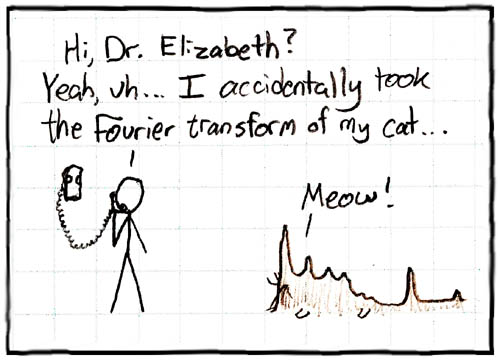
As you can see, the Fourier theorem is very powerful, so be careful how you apply it.

[Source: xkcd.com/26/]
No comments:
Post a Comment