Wednesday, December 25, 2013

Response Time Percentiles for Multi-server Applications

In a previous post, I applied my rules-of-thumb for response time (RT) percentiles (or more accurately, residence time in queueing theory parlance), viz., 80th percentile: $R_{80}$, 90th percentile: $R_{90}$ and 95th percentile: $R_{95}$ to a cellphone application and found that the performance measurements were not completely consistent. Since the relevant data only appeared in a journal blog, I didn't have enough information to resolve the discrepancy; which is ok. The first job of the performance analyst is to flag performance anomalies but most probably let others resolve them—after all, I didn't build the system or collect the measurements.

More importantly, that analysis was for a single server application (viz., time-to-first-fix latency). At the end of my post, I hinted at adding percentiles to PDQ for multi-server applications. Here, I present the corresponding rules-of-thumb for the more ubiquitous multi-server or multi-core case.

Single-server Percentiles

First, let's summarize the Guerrilla rules-of-thumb for single-server percentiles (M/M/1 in queueing parlance): \begin{align} R_{1,80} &\simeq \dfrac{5}{3} \, R_{1} \label{eqn:mm1r80}\\ R_{1,90} &\simeq \dfrac{7}{3} \, R_{1}\\ R_{1,95} &\simeq \dfrac{9}{3} \, R_{1} \label{eqn:mm1r95} \end{align} where $R_{1}$ is the statistical mean of the measured or calculated RT and $\simeq$ denotes approximately equal. A useful mnemonic device is to notice the numerical pattern for the fractions. All denominators are 3 and the numerators are successive odd numbers starting with 5.

Sunday, December 1, 2013

Guerrilla Training Schedule for 2014

With the newfound popularity of smaller sessions that offer highly personalized tuition—along the lines of the Oxbridge system—all of the 2014 Guerrilla classes held in California will be limited to a maximum of 6 students. Overflow will go onto a waiting list for the equivalent class that will be held on a date to be determined. Waitees will be notified accordingly. So book early, book often!

Friday, October 25, 2013

The Importance of 2 + ε Dimensions: Flat is the Name of the Game

In a 2010 email, I wrote the following about Steve Jobs:
Sent: Mon, May 31, 2010 5:02:32 PM
Subject: Why Jobs has been vindicated on quality

Observation: Jobs has finally been vindicated on his stand over high quality (and premium price, although not as premium as it used to be). Why?

Theory: Jobs has made the computer 2-dimensional.

Data: From the earliest days of the Mac, Jobs preached quality (there's even a video clip with him slagging Gates for failing to understood quality). For 2 decades Jobs was proven wrong, in the sense that customers were not willing to pay a premium for quality, so Apple never garnered more than 4-5% of the PC market.

Monday, October 21, 2013

What happened at HealthCare.gov?

On Oct. 6th Federal officials admitted the online marketplace needed design changes, as well as more server capacity to improve efficiency on the federally run exchange that serves 36 states. More details in this WSJ article.

And finally, from the PR horse's mouth on Oct 20th:

"Initially, we implemented a virtual 'waiting room,' but many found this experience to be confusing. We continued to add more capacity in order to meet demand and execute software fixes to address the sign up and log in issues, stabilizing those parts of the service and allowing us to remove the virtual 'waiting room.' "
Quite apart from the bizarre architectural description, a "virtual waiting room" implies a buffer or buffers where pending requests must wait for service because the necessary resources to complete those requests are not available due to being either busy or failed. A certain amount of waiting time can be tolerated by users (both applicants and providers) but if it becomes too long or simply fails to complete, that kind of poor performance points to grossly under-scaled capacity in the original design.

Sunday, September 15, 2013

Laplace the Bayesianista and the Mass of Saturn

I'm reviewing Bayes' theorem and related topics for the upcoming GDAT class. In its simplest form, Bayes' theorem is a statement about conditional probabilities. The probability of A, given that B has occurred, is expressed as: \begin{equation} \Pr(A|B) = \dfrac{\Pr(B|A)\times\Pr(A)}{\Pr(B)} \label{eqn:bayes} \end{equation} In Bayesian language, $\Pr(A|B)$ is called the posterior probability, $\Pr(A)$ the prior probability, and $\Pr(B|A)$ the likelihood (essentially a normalization factor).

Source: Wikipedia

Sunday, August 25, 2013

GDAT Class October 14-18, 2013

This is your fast track to enterprise performance and capacity management with an emphasis on applying R statistical tools to your performance data.

Early-bird discounts are available for the Level III Guerrilla Data Analysis Techniques class Oct 14—18.

Entrance Larkspur Landing hotel Pleasanton California

As usual, all classes are held at our lovely Larkspur Landing location in Pleasanton. Attendees should bring their laptops to the class as course materials are provided on a flash drive. Larkspur Landing also provides free wi-fi Internet in their residence-style rooms as well as the training room.

Monday, July 8, 2013

What's Wrong with This Picture?

Here are some examples of how not to display performance data. Remember: collecting and analyzing your performance data is only half the battle. The other, equally difficult, half is presenting your performance data and conclusions.

Example 1

This first example is an oldie but a baddie. It will also provide some context for the second example below.

Figure 1 (click to enlarge)
See the problem?

Wednesday, June 19, 2013

Capacity Planning Classes in August 2013

Bookings are open for both Guerrilla Boot Camp (GBoot) and Guerrilla Capacity Planning (GCaP) classes in August 2013 at the Early Bird rate.

Entrance Larkspur Landing hotel Pleasanton California

As usual, classes will be held at our lovely Larkspur Landing location. Click on the image for booking information. Here are some comments contributed by Guerrilla alumni.

Attendees should bring their laptops, as course materials are provided on CD or flash drive. The venue also offers free wi-fi to the internet.

Wednesday, May 15, 2013

Exponential Cache Behavior

Guerrilla grad Gary Little observed certain fixed-point behavior in simulations where disk IO blocks are updated randomly in a fixed size cache. For his python simulation with 10 million entries (corresponding to an allocation of about 400 MB of memory) the following results were obtained:
  • Hit ratio (i.e., occupied) = 0.3676748
  • Miss ratio (i.e., inserts) = 0.6323252

In other words, only 63.23% of the blocks will ever end up inserted into the cache, irrespective of the actual cache size. Gary found that WolframAlpha suggests the relation: \begin{equation} \dfrac{e-1}{e} \approx 0.6321 \label{eq:walpha} \end{equation} where $e = \exp(1)$. The question remains, however, where does that magic fraction come from?

Sunday, April 28, 2013

Visual Proof of Little's Law Reworked

Back in early March, when I was at the Hotsos Symposium on Oracle performance, I happened to end up sitting next to Alain C. at lunch. He always attends my presentations, especially on USL scalability analysis. During our lunchtime conversation, he took out his copy of Analyzing Computer System Performance with Perl::PDQ and opened it at the section on the visual proof for Little's law. Alain queried (query ... Oracle ... Get it?) whether the numbers really added up the way they are shown in the diagrams. It did look like there could be a discrepancy but it was too difficult to reanalyze the whole thing over lunch.

Friday, April 26, 2013

Book Review: Botched Erlang B and C Functions

As a consequence of looking into a question on the GCaP google group about the telecom performance metric known as the busy hour, I came across this book.

A new copy comes with a $267.44 price tag!!! Here is my review; slightly enhanced from the version I wrote on Amazon.

Monday, April 22, 2013

Adding Percentiles to PDQ

Pretty Damn Quick (PDQ) performs a mean value analysis of queueing network models: mean values in; mean values out. By mean, I mean statistical mean or average. Mean input values include such queueing metrics as service times and arrival rates. These could be sample means. Mean output values include such queueing metrics as waiting time and queue length. These are computed means based on a known distribution. I'll say more about exactly what distribution, shortly. Sometimes you might also want to report measures of dispersion about those mean values, e.g., the 90th or 95th percentiles.

Percentile Rules of Thumb

In The Practical Performance Analyst (1998, 2000) and Analyzing Computer System Performance with Perl::PDQ (2011), I offer the following Guerrilla rules of thumb for percentiles, based on a mean residence time R:
  • 80th percentile: p80 ≃ 5R/3
  • 90th percentile: p90 ≃ 7R/3
  • 95th percentile: p95 ≃ 9R/3

I could also add the 50th percentile or median: p50 ≃ 2R/3, which I hadn't thought of until I was putting this blog post together.

Upcoming GDAT Class May 6-10, 2013

Enrollments are still open for the Level III Guerrilla Data Analysis Techniques class to be held during the week May 6—10. Early-bird discounts are still available. Enquire when you register.

Entrance Larkspur Landing hotel Pleasanton California


As usual, all classes are held at our lovely Larkspur Landing location. Before registering online, take a look at what former students have said about the Guerrilla courses.

Attendees should bring their laptops, as course materials are provided on CD or flash drive. Larkspur Landing also provides free Internet wi-fi in all rooms.

Thursday, April 18, 2013

The Most Important Scatterplot Since Hubble?

In 1929, the astronomer Edwin Hubble published the following scatterplot based on his most recent astronomical measurements.


Figure 1. Edwin Hubble's original scatterplot

It shows the recession velocity of the "stars" (in km/s) on the y-axis and their corresponding distance (in Megaparsecs) on the x-axis. A Megaparsec is about 3.25 million light-years. This scatterplot is important for several reasons:

Tuesday, April 9, 2013

Harmonic Averaging of Monitored Rate Data

The following slides constitute evolving notes made in response to remarks that arose during the Monitorama Conference in Boston MA, March 28-29, 2013. Since they are evolving, the content will be updated continuously in place. So, get on RSS or Twitter or check back often to read the latest version.

During the Graphite workshop session at Monitorama, the topic of aggregating monitored rate data came up. This caused me to interject the cautionary comment:

Friday, March 29, 2013

Monitorama 2013 Conference

Here is my Keynote presentation that opened the first Monitorama conference and hackathon in Cambridge MA yesterday:

Comments from the #monitorama Twitter stream:

Thursday, February 7, 2013

Extracting the Epidemic Model: Going Beyond Florence Nightingale Part II

This is the second of a two part reexamination of Florence Nightingale's data visualization based on her innovative cam diagrams (my term) shown in Figure 1.

Figure 1. Nightingale's original cam diagrams (click to enlarge)

Recap

In Part I, I showed that FN applied sectoral areas, rather than a pie chart or conventional histogram, to reduce the visual impact of highly variable zymotic disease data from the Crimean War. She wanted to demonstrate that diminishing disease was due mostly to her sanitation methodologies. The square-root attenuation of magnitudes, arising from the use of sectoral areas, helped her accomplish that objective. In addition, I showed that a plausibly simpler visualizaiton could have been had with a single 24-month cam diagram. See Fig. 2.

Figure 2. Combined 24-month cam diagram

Thursday, January 31, 2013

Modem Memories Decoded

If you've ever used a phone line to connect to the Internet or sent a fax, you're familiar the racket that precedes the actual data transmission. Not exactly a Beethoven symphony. Even if you are very familiar with the sounds and know it's "handshaking" with the other modem in order to create a comms channel, you probably don't know precisely what is going on with all that warbling and hissing.

Oona Räisänen (windytan) has put together a very nice annotated sonogram and explanation on her blog. That the whole thing sounds more like bursting artillery shells than dueling banjos is partly a result of the protocol trying to defeat sophisticated circuitry for noise cancellation and echo suppression on the telephone network.

Wednesday, January 23, 2013

Going Beyond Florence Nightingale's Data Diagram: Did Flo Blow It with Wedges?

In 2010, I wrote a short blog item about Florence Nightingale the statistician, solely because of its novelty value. I didn't even bother to look closely at the associated graphic she designed, but that's what I intend to do here. In this first installment, I reflect on her famous data visualization by reconstructing it with the modern tools available in R. In part two, I will use the insight gained from that exercise to go beyond data presentation to potentially more revealing data modeling. Interestingly, I suspect that much of what I will present could also have been accomplished in Florence Nightingale's day, more than 150 years ago, albeit not as easily and not by her alone.

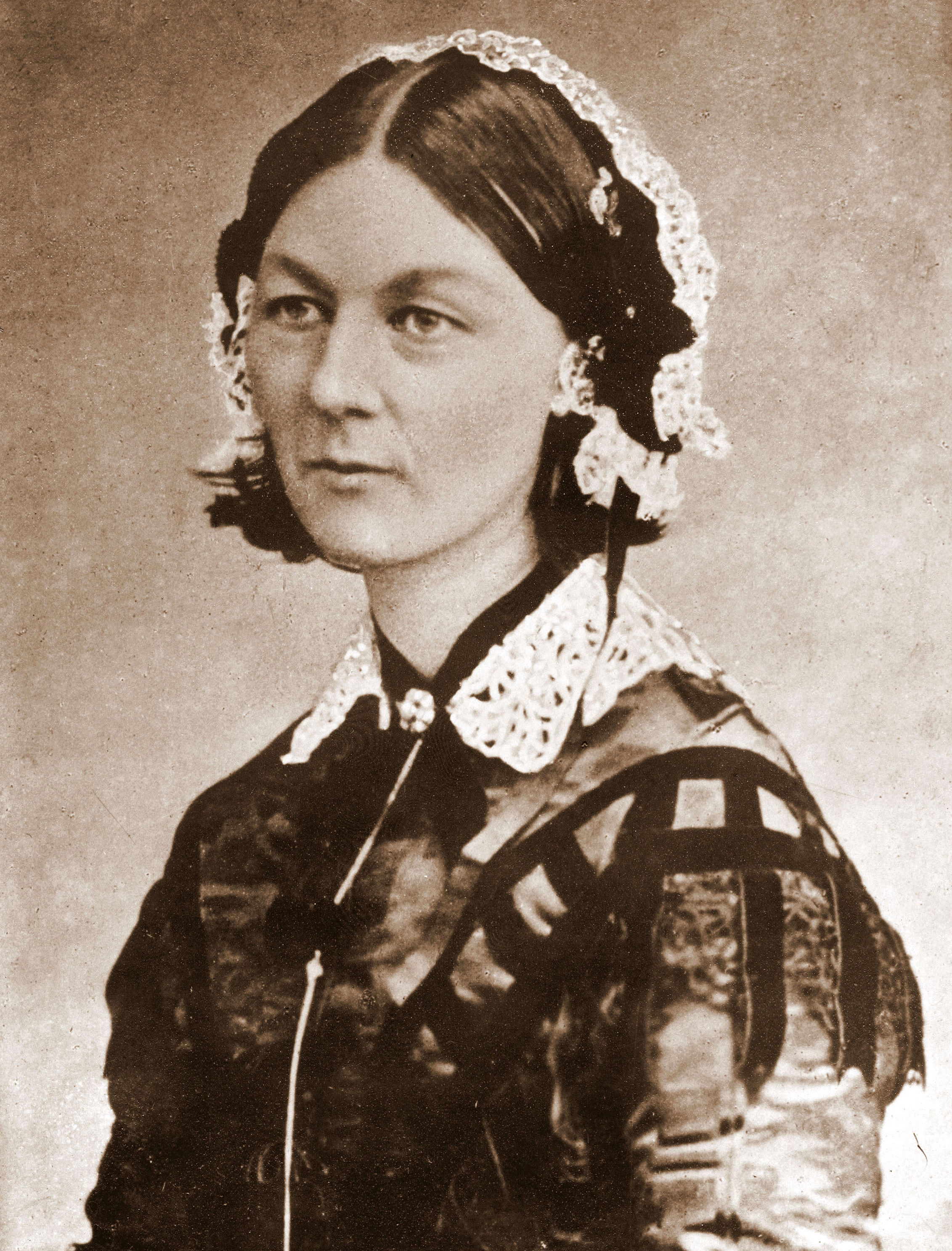
Figure 1. Nightingale and her data visualization (click to enlarge)

Although Florence Nightingale was not formally trained as a statistician, she apparently had a natural aptitude for mathematical concepts and evidently put a lot of thought into presenting the import of her medical findings in a visual way. Click on Figure 1 to enlarge it and view the details in her original graphic. As a consequence, she was elected the first female member of the Royal Statistical Society in 1859 and later became an honorary member of the American Statistical Association.

Why Wedges?

Why did FN bother to construct the data visualization in Figure 1? If you read her accompanying text, you see that she refers to the sectors as wedges. In a nutshell, her point in devising Figure 1 was to try and convince a male-dominated, British bureaucracy that better sanitary methods could seriously diminish the adverse impact of preventable disease amongst military troops on the battlefield. The relative size of the wedges is intended to convey that effect. Later on, she promoted the application of the same sanitation methodologies to public hospitals. She was using the established term of the day, zymotic disease, to refer to epidemic, endemic, and contagious diseases.

Friday, January 18, 2013

Linux Per-Entity Load Tracking: Plus ça change

Canadian capacity planner, David Collier-Brown, pointed me at this post about some more proposed changes to how load is measured in the Linux kernel. He's not sure they're on the right track. David has written about such things as cgroups in Linux and I'm sure he understands these things better than I do, so he might be right. I never understood the so-called CFS: Completely Fair Scheduler. Is it a fair-share scheduler or something else? Not only was there a certain amount of political fallout over CFS but, do we care about such things anymore? That was back in 2007. These days we are just as likely to run Linux in a VM under VMware or XenServer or the cloud. Others have proposed that the Linux load average metric be made "more accurate" by including IO load. Would that be local IO, remote IO or both? Disk IO, network IO, etc., etc?

Monday, January 14, 2013

The Social Network Ranking is Wrong

Call me old-fashioned, but I never saw the 2010 movie The Social Network until last year (at a private screening). In case you also missed it, it's the Hollywood version of how Facebook.com came into being.

Quite apart from any artistic criticisms, I have a genuine psychological problem with movies like TSN. I keep getting caught up in technical inaccuracies and tend to lose the plot. So, it's very hard for me to watch such movies as the director intended. It's the same reason I can't stand SciFi movies or books: I can't get past the impossible and the just plain wrong. It turns out that TSN is generally fairly accurate regarding things like Linux, MySQL, PHP, and so forth, but there is a real clanger: the ranking algorithm used by Facemash—the Facebook precursor.

There's a scene where the Mark Zuckerberg character wants to rank Harvard women based on crowd-sourced scores. He recalls that his best friend (at the time), Eduardo Saverin, had previously mentioned a ranking formula, but Zuck can't remember how it goes, so he can't code it. When Saverin shows up again, Zuck urgently asks him to reveal it. In typical Hollywood style—possibly to keep a generally math-phobic audience visually engaged—Saverin writes the ranking equations on the dorm window (see above image) for the desperate Zuckerberg. Where else would you write equations?

Here they are, reproduced with a little better formatted: \begin{align} Ea &= \dfrac{1}{1 + 10 (Rb-Ra)/400}, & Eb &= \dfrac{1}{1 + 10 (Ra-Rb)/400} \label{eqn:movie} \end{align} There's just one slight problem: they're wrong!

Friday, January 11, 2013

Oracle Java 7 Security Vulnerability

National Cyber Awareness System

US-CERT Alert TA13-010A
Oracle Java 7 Security Manager Bypass Vulnerability

Original release date: January 10, 2013

Systems Affected

Any system using Oracle Java 7 (1.7, 1.7.0) including
  • Java Platform Standard Edition 7 (Java SE 7)
  • Java SE Development Kit (JDK 7)
  • Java SE Runtime Environment (JRE 7)
All versions of Java 7 through update 10 are affected. Web browsers using the Java 7 plug-in are at high risk.

Sunday, January 6, 2013

Visualizing Variance

The typical presentation of variance in textbooks often looks like this Wikipedia definition. Quite daunting for the non-expert. So, how would you explain the notion of variance to someone who has little or no background in statistics and couldn't easily digest all that gobbledygook?

The Mean

Let's drop back a notch. How would you explain the statistical mean? A common way to do that is to utilize the simple visual device of the "bell curve" belonging to the normal distribution (Fig. 1).

Figure 1. A normal distribution

The normal distribution, $N(x,\mu,\sigma^2)$, is specified by two parameters:

  1. Mean, usually denoted by $\mu$
  2. Variance, usually denoted by $\sigma^2$
that determine (1) the location and (2) the shape of the curve. In Fig. 1, $\mu = 4$. Being a probability, the curve must be normalized to enclose unit area. Also, since $N(x)$ is unimodal and symmetric about $\mu$, the mean, median and mode are all located at the same position on the $x$-axis. Therefore, it's easy to point to the mean as being the $x$-position of the peak. Anybody can see that immediately. Mission accomplished.

But what about the variance? Where is that in Figure 1?