Of course, it doesn't stop there. The most important part of making an educated guess is testing its validity. That's called hypothesis testing, in scientific circles. To paraphrase the well-known Russian proverb, in contradistinction to BAAG: Guess, but justify*. Because all hypothesis testing is a difficult process, it can easily get subverted into reaching the wrong conclusion. Therefore, it is extremely important not to set booby traps inadvertently along the way. One of the most common visual booby trap arises from the inappropriate use of logarithmically-scaled axes (hereafter, log axes) when plotting data.
- Linear scale:
- Each major interval has a common difference $(d)$, e.g., $200, 400, 600, 800, 1000$ if $d=200$:
- Log scale:
- Each major interval has a common multiple or base $(b)$, e.g., $0.1, 1, 10, 100, 1000$ if $b=10$:
Lies and Plots
The following examples show the kind of visual distortion caused by the inappropriate use of the log transform to the $x$-axis.- Linear data:
Let's start with the most straightforward case, a straight line. For simplicity, I've shown a continuous line, but we can also think of it as a dense set of data points. An example might be the consumption of memory with increasing number of user processes.

Fig. 1 Linear data shown correctly on the left and incorrectly on the right The curvature in the right-hand plot of Fig. 1 is due to the use of a log-scaled $x$-axis. The curvature is an artifact of the logarithmic transformation of the $x$ component of the data coordinates. And since people tend to look at shapes without reading the numbers on the axes (reading numbers is a much more expensive cognitive process) the overall effect is to produce a visual miscue: curves where there was none originally.
- Curved data:
Now, let's introduce a nonlinear curve in the left-hand plot and see what happens when we transform the $x$-axis in the right-hand plot. An example nonlinear curve might be throughput data (e.g., MB/s on the $y$-axis). Since the $x$-axis range here is rather big, this throughput could be the kind of thing seen when using Hadoop or MapReduce processes, processors, cluster nodes or machines.

Fig. 2 Throughput data shown correctly on the left and incorrectly on the right As a general matter, all throughput curves should be approximately concave as shown in the left-hand plot of Fig. 2. The right-hand plot on the other hand is both convex near the origin, and concave at the high end. The artificial convex curvature in the right-hand plot of Fig. 2 is due to the log-transformed $x$-axis.

Visual distortion of Amdahl's law due to log-axis as seen on the Wikipedia This false curvature is bad because it suggests that the throughput starts out with one slope and then increases its slope in the mid range. In other words, it looks like superlinear speedup when, in fact, there is none. The misuse of a logarithmic $x$-axis causes a visual booby trap.


Diagnostic Log Plots
Having stated why log axes are generally a bad idea, there are some exceptions. Used carefully, log-axes can offer a very powerful device for visually checking certain educated guesses that you might have about your data. Here are some examples.- Logarithmic data: Once again, let's consider concave data like that in Fig. 2, but this time having a very specific form: the logarithmic profile shown in the left-hand plot.

Fig. 3 Logarithmic data on the left will appear linear on the right The diagnostic value of using a logarithmically scaled $X$-axis here is that the log transform in the right-hand plot exactly compensates for the logarithmic curvature in the left-hand plot and straightens it out in a visually clear way.
As an example of diagnostic usage, suppose you guessed the throughput data in left-hand plot of Fig. 2 belonged to a logarithmic profile. An entirely reasonable guess since a logarithmic curve is also concave, as can be seen from the resemblance to the left-hand plot in Fig. 3. That would be your hypothesis. Now, you need to test your hypothesis. If it's true, a log-axis transform of the data should produce a straight line in the right-hand plot. Clearly, the right-hand plot in Fig. 2 is not a straight line so, we can conclude immediately and visually that the data in the left-hand plot of Fig. 2 are not logarithmic.
- Exponential data: A similar situation applies when the data has the exponential profile shown in the left-hand plot of Fig. 4. Since the exponential function is the inverse of the logarithm function, we scale the $Y$-axis logarithmically in this case.
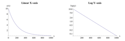
Fig. 4 Exponential data on the left will appear linear on the right The diagnostic value of using a log-scaled $y$-axis is that the log transform in the right-hand plot exactly compensates for the exponential curvature in the left-hand plot and straightens it in a way analogous to Fig. 3.


Laws for Log Plots
- Don't. Just because the option exists in Excel (or whatever plotting tool you use), doesn't mean you should actually use it. Do not use log axes arbitrarily or whimsically and, if possible, avoid them altogether. They can be the source of visual booby traps and other misunderstandings.
- Graduations. What appears to be a simple change to the tick marks on the axis is actually a nonlinear transformation on the data you are plotting. Nonlinear transforms trend to introduce curvatures that are not present in the actual data. It also forces your audience to read the axis graduations and that's a pain which detracts from the purpose of visual presentation, so they probably won't.
- Sub plots. If you feel you need to reveal more clearly what is going on at the low end, then create another (linear) plot as a separate zoomed figure (with a smaller scale range) or a sub-figure embedded in the main (linear) plot. To reveal more about the low end ($x < 200$) in Fig. 2, for example, make a separate plot with the $x$-axis ranging (linearly) between $0$ and $200$.
- Label it. When a log transform is applied to an axis scale, it should be clearly and explicitly labeled as such, e.g., use $\mathbf{log(x)}$, not just $\mathbf x$. It is less important to denote which kind of logarithm (common, natural or binary) is being used.
- Diagnostics. Log-linear plots can be a powerful diagnostic tool, if you suspect that the data profile might be either exponential or logarithmic. But use with caution.
What about the sex?
Oh yeah, the sex part. Do you seriously think for one minute that I would employ the word "sex" in the title of this blog post just to get you to read it? Like a Hollywood movie‡? You know I always deliver. Here you go ...
* The phrase Trust, but verify is often incorrectly attributed to Pres. Ronald Reagan, who merely learned it (like an actor) for use in speeches; especially those directed at the then Soviet Union.
† This type of visual distortion is well-known and sometimes used in marketing presentations. As I explain in my Guerrilla classes, logarithmic distortion of competitive data is partly behind the SPEC benchmark using the geometric mean. The compression effect at the high end helps to maintain the impression that competitive overachievers are not as far ahead of the general bunch as they would appear on a linear scale.
‡ Sex, Lies, and Videotape (1989)
§ Yes, I wrote this post on April Fool's Day, but it's no joke.
2 comments:
Thank you for posting this. Very useful and educative examples how one should careful check plots and data representation in vendor material for example.
There are lot of such plots found in white papers, benchmark and technical literature. log(x) looks obscure and hard to digest when for example plotting throughput. As you say: Dont do it !
Now updated to include an example of visual distortion in the case of Amdahl scaling, taken from Wikipedia.
If you feel so inclined, please point me at any other linkable examples you come across.
Post a Comment