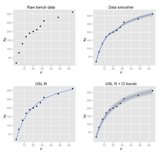
For a long time I've been on a crusade about including error reporting and display in computer performance data. ggplot2 has a lot of inbuilt features to easily enable such displays—CBs being one of them. Unfortunately, many of the ggplot2 examples assume the application of linear models or data smoothers.
The USL requires confidence bands for a nonlinear model that is solved using the nls function in R. The distinction can be seen in Figure 1. The first plot (upper left) shows the raw data taken from Chapter 5 and Appendix B in my GCaP book. The independent variable (p) is the number of physical processors and the dependent variable (Xp) is the measured throughput for that processor configuration. The second plot (upper right) shows what happens if you apply an inbuilt ggplot2 data-smoother like this:
qplot(p, Xp, data=bmark, geom=c("point", "smooth"), main = "Data smoother")
This is very convenient if you are just trying to visualize underlying trends or patterns in the data. For the proper analysis of scalability data, however, we need a predictive (nonlinear) model, and that's role of the USL—a physically constrained model. To apply the USL, we first normalize the raw performance data to get USL coefficients (σ and κ) and then fit the USL model to the original data, which looks like this in R:
X1  <- bmark$Xp[1]
Cp  <- bmark$Xp / X1
usl <- nls( Cp ~ p/(1 + A * (p-1) + B * p * (p-1)), data=bmark, start=c(A=0.1, B=0.01) )

curves     <- with(bmark, expand.grid(p=seq(min(p), max(p), length=100)))
curves$fit <- X1 * predict(usl, newdata=curves)
qplot(p, Xp, data=bmark) + geom_smooth(aes(y=fit), data=curves, stat="identity")
It is often preferable to place important information, such as the fitted USL parameters, right in the plot panel itself. This might not be considered aesthetic by graphics purists but it saves looking for that information separately—especially when it might not be at hand—and it is not semantically equivalent to a conventional legend. Although this kind of embedded text is generally shunned for aesthetic reasons in ggplot2, the newer annotate construct does facilitate it. As you can see in Figure 2, the most recent version is also capable of parsing math notation.
Here is the complete R script:
# USL confidence bands using ggplot2 functions
#
# Created by NJG on Wed Sep  1 08:47:21 2010
# Updated by NJG on Sat Sep  4 22:14:25 2010

library(ggplot2)
library(gridExtra)

# Benchmark data from Table 5.1 in GCaP book www.perfdynamics.com/iBook/gcap.html
bmark <- read.table(textConnection("p Xp
1 20
4 78
8  130
12  170
16  190
20  200
24  210
28  230
32  260
48  280
64  310"), header=TRUE)
closeAllConnections()

# Look at raw data and cf. standard smoother fit
p1 <- qplot(p, Xp, data=bmark, main="Raw bench data")
p2 <- qplot(p, Xp, data=bmark, geom=c("point", "smooth"), main = "Data smoother")

samples <- dim(bmark)[1]
degfree <- samples - 1

# Normalize bench data to get USL coeffs
X1  <- bmark$Xp[1]
Cp  <- bmark$Xp / X1
usl <- nls( Cp ~ p/(1 + A * (p-1) + B * p * (p-1)), data=bmark, start=c(A=0.1, B=0.01) )

# Rescale to bench data for stat calcs
y.usl <- predict(usl) * X1
y.mu  <- mean(bmark$Xp)
y.se  <- sqrt(sum((bmark$Xp-y.usl)^2) / degfree)
sse   <- sum((bmark$Xp-y.usl)^2)
sst   <- sum((bmark$Xp-y.mu)^2)
y.r2  <- 1 - sse / sst
y.ci  <- y.se * qt(0.95, degfree)

curves     <- with(bmark, expand.grid(p=seq(min(p), max(p), length=100)))
curves$fit <- X1 * predict(usl, newdata=curves)
curves$ucl <- curves$fit + y.ci
curves$lcl <- curves$fit - y.ci

p3 <- qplot(p, Xp, data=bmark, main="USL fit") + geom_smooth(aes(y=fit), data=curves, stat="identity")
p4 <- qplot(p, Xp, data=bmark, main="USL fit + CI bands")  +
   geom_smooth(aes(y=fit, ymin=lcl, ymax=ucl), data=curves, stat="identity")
grid.newpage()
print(grid.arrange(p1, p2, p3, p4, nrow=2, ncol=2))

p <- qplot(p, Xp, data=bmark, main="USL Analysis of SGI Origin 2000",xlab="Processors", ylab="Benchmark throughput (Krays/s)")  +
   geom_smooth(aes(y=fit, ymin=lcl, ymax=ucl), data=curves, stat="identity") +
   annotate("text", x=30, y=100, label="See GCaP book Chap. 5 & App. B", hjust=0, vjust=0, size=4)
p <- p + annotate("text", x=30, y=88, label=paste("sigma == ", coef(usl)['A']), parse=T, hjust=0, size=4)
p <- p + annotate("text", x=30, y=75, label=paste("kappa == ", coef(usl)['B']), parse=T, hjust=0, size=4)
p <- p + annotate("text", x=30, y=62, label=paste("R^2 == ",y.r2), parse=T, hjust=0, size=4)
print(p)
- The syntax is very different and it takes a while to become familiar with it.
- Rendering is painfully slow, although I understand this is being addressed.
- Divining the author's intent when customizing certain constructs almost requires divine intervention.


So why not just use a polygon to plot the confidence region? Doesn't it seem a bit easier that way?
ReplyDeleteThank you for the post, extremely helpful.
ReplyDeleteI kept getting the following error in the nls line:
"Error in nls(Cp ~ p/(1 + A * (p - 1) + B * p * (p - 1)), data = bmark, :
number of iterations exceeded maximum of 50"
I changed the command to:
usl <- nls( Cp ~ p/(1 + A * (p-1) + B * p * (p-1)), data=bmark, start=c(A=0.1, B=0.01), control = list(maxiter = 500))
Hope this helps anyone that encounters the same problem.
Thanks again!
Best,
Harris
It doesn't make a huge difference, but shouldn't degfree be samples - 2 since we are estimating two different parameters in the nonlinear regression?
ReplyDeleteRegards,
Stefan
I believe the short answer goes something like this. The DOF is associated with the Student's t dsn qt() b/c the sample size is n<30 measurements. That can be regarded as a single parameter dsn b/c the mean is assumed to be zero. More generally, the Chi-Sq dsn, for example, estimates the population mean and var. In the large-N limit this becomes a Gaussian, which has 2 pop parameters. The figure of merit for the USL nonlinear model (rational function of a single variable N and 2 coefficients α and β) is the Adjusted R^2 value.
ReplyDelete